We live in very visual times. Every day we are assaulted by colour, images, video and all manner of branding messages, subliminally raising our design expectations.
Events are part of this phenomenon, attention seekers in the extreme since we don’t just want someone to say ‘that’s nice’ we want them to like it sufficiently to want to take part. We want to build communities and word of mouth advocacy. Our branding needs to say ‘Hi. I’m back. Remember me. Come to my party.’ Since our visual memory is far more acute than our auditory memory, it is very important to ensure that the messages we put out this year are directly related to those from last year if we want previous visitors to make a positive connection.
 Within the events industry we aren’t particularly good at maintaining any kind of visual consistency. Many organisers don’t undertake a comprehensive branding exercise in the first instance, primarily because in comparison with paying a freelance designer to come up with a couple of ideas it can feel extraordinarily expensive. Instead, each year the collateral for the event is completely redesigned often for no good reason.
Having recently undertaken a branding exercise with a leading London agency, it has been enlightening to have a group of very talented individuals giving hours of thought to the identity that will be public facing for the foreseeable future. While the fees wouldn’t sit happily into an individual event marketing budget, the artwork and guidelines will be used consistently for the next five years at least, and will result in significantly less spend overall on design in the long term.
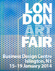
 A number of organisers do manage their brand and image exceptionally well. If you are anywhere near the Business Design Centre in Islington this week, you will have no difficulty in spotting the London Art Fair organised by the team at Upper Street Events. Some years ago they undertook the first rebranding exercise, delivering an instantly recognisable logo which could be used across all their communications, whilst being adaptable to any environment.
 Recently this has been updated, but you would still be in little doubt that this is the same successful event.
 Where the team have been particularly clever, is in creating a brand which allows change but not destruction. Regardless of the focus of a particular advert, email or other marketing message, be it Modern British Art or Photography, the event is ever present through its well designed identity.
As our audiences, whether they be festival-goers or manufacturers of medical devices, become more sophisticated visually and bombarded by imagery, it is increasingly important that we take the branding of our events more seriously and invest more wisely in creating engaging, long-lasting brands.

